Dhaka Youths in Action: Shaping Urban Future Through Open Data
Publié par Tony Liong, Honey Grace Fombuena • 18 mars 2026
Thank you to the participants of the Dhaka Thrive Challenge and fellows from the Climate Resilience Fellowship whose insights helped shape this article: Abu Syed Al-Imam, Fida Hasan, Ronit Roy, Sadia Afrin Sayfa Negaban, Shuvo Kumar Chowdhury, Asif Bin Alam Seum, Brazil Singh, Faiza Waziha, Nafisa Nandini, Sumaya Rahmatullah.
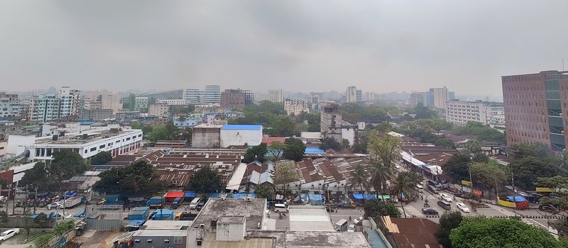
View of Dhaka City, the second most populated city in the world and home to more than 36 million residents. Data source: World Urbanization Prospects 2025, UN DESA | Photo: Can Ünen / Open Mapping Hub - Asia-Pacific
As one of the fastest-growing megacities in the world, Dhaka, the capital of Bangladesh, faces significant urban challenges. Rapid migration to the city, combined with limited affordable housing and space, has led to the expansion of informal settlements. These settlements are often overlooked in official datasets, with critical information on essential facilities and hazards either fragmented, outdated, or incomplete.
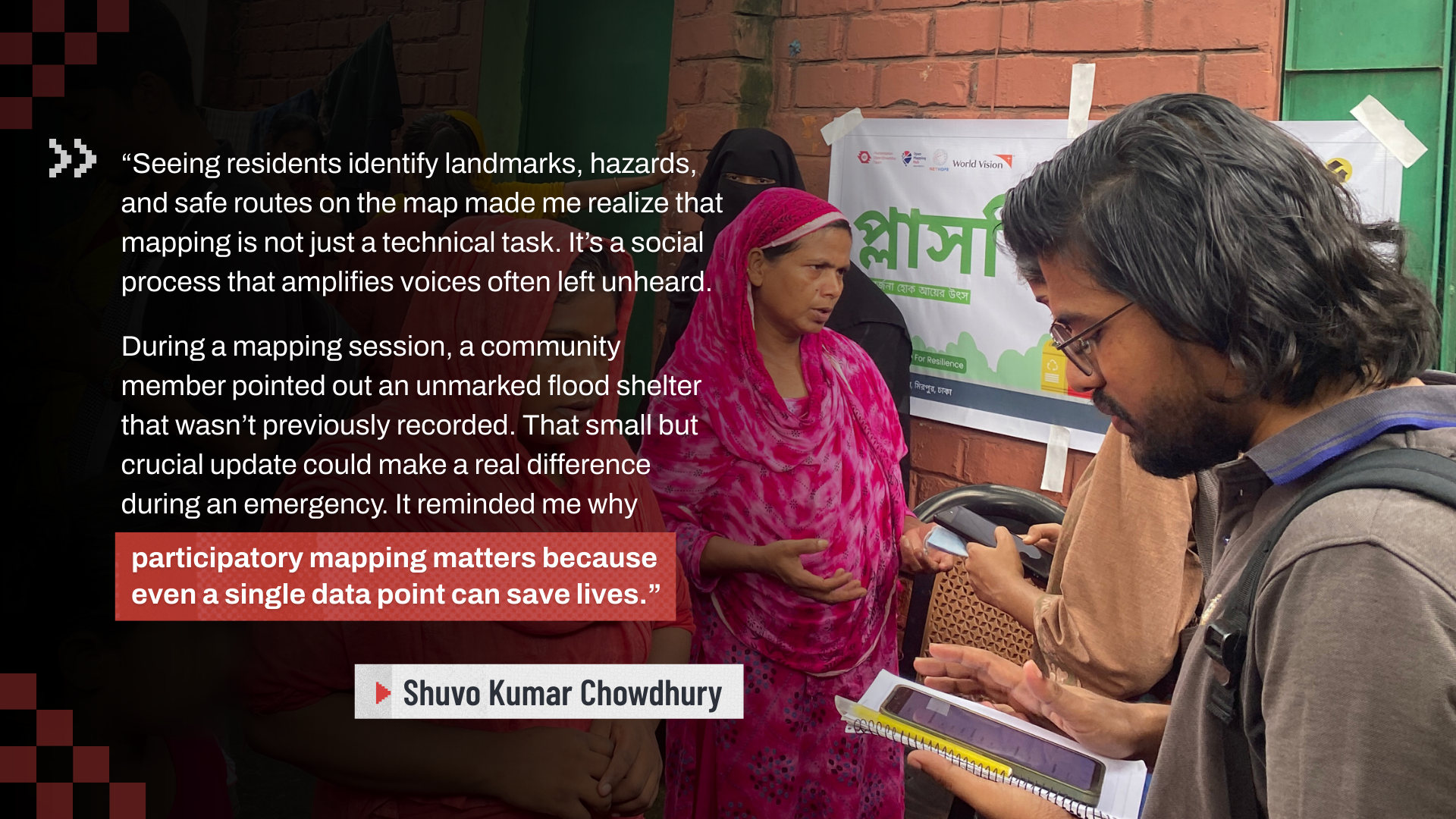
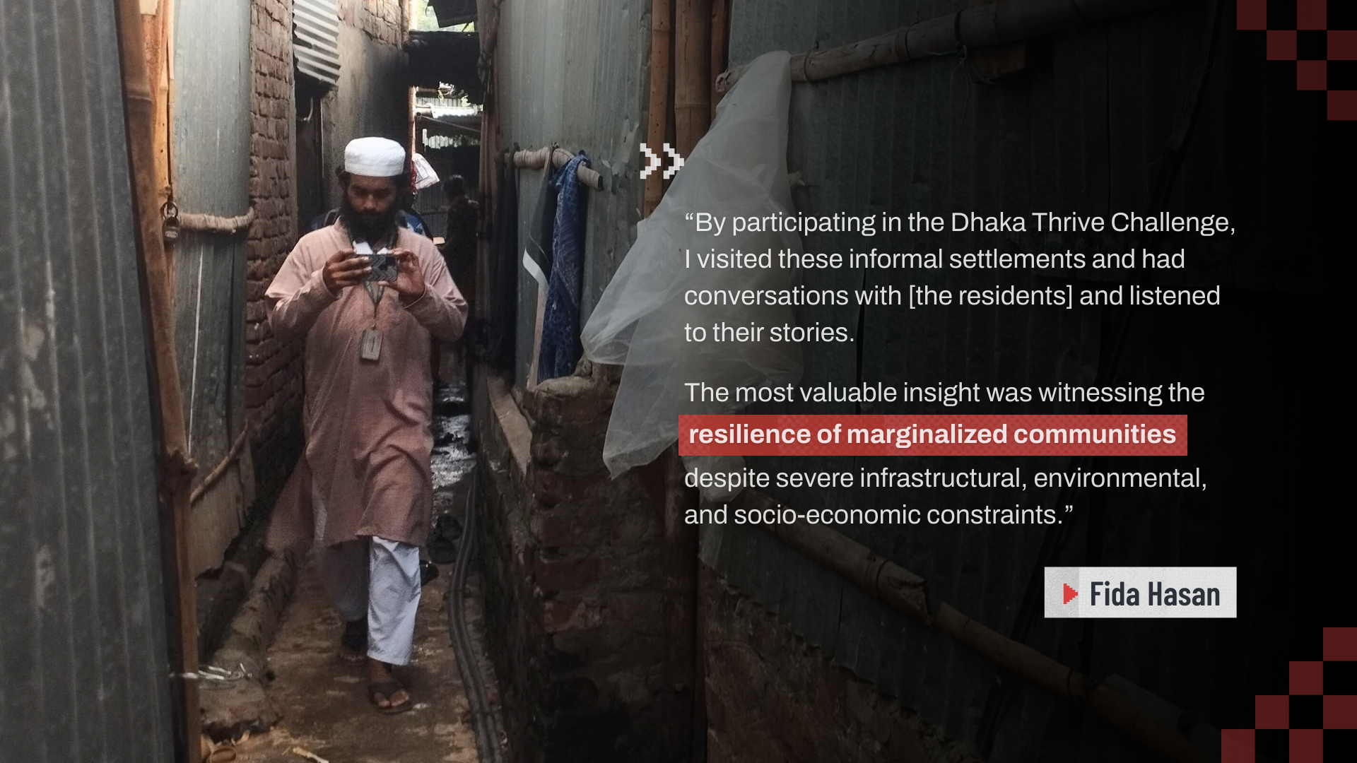
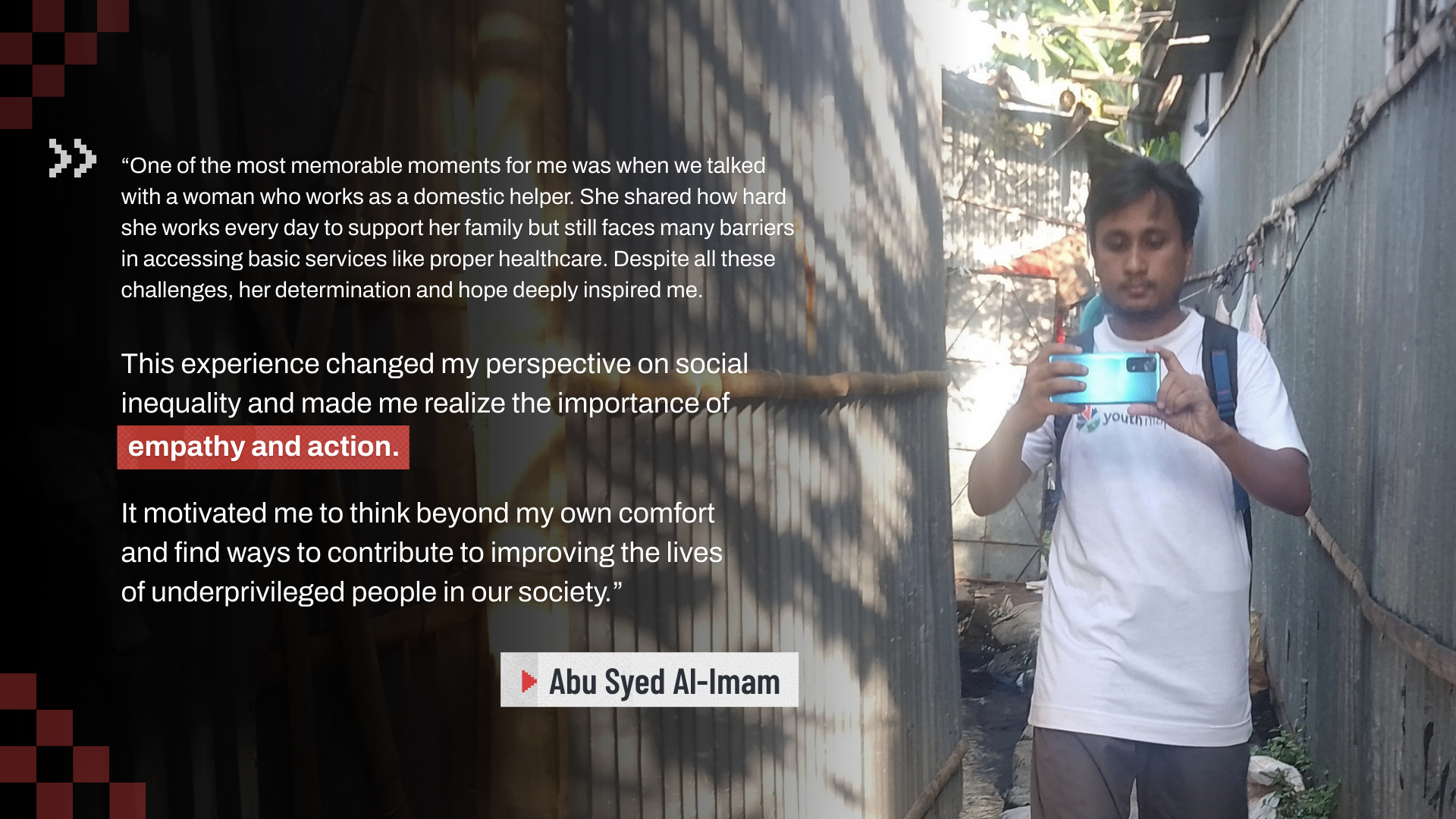
“I have been living in Dhaka for several years, but I had never visited the slum* areas or known much about the lives of the people living there. However, while working on the Dhaka Thrive Challenge, our team visited several slum areas and spoke with the residents. Many people live together in a single small room, and one toilet is often shared by many families. Hygiene is not properly maintained. There are also not enough hospitals or schools.” – Abu Syed Al-Imam, Dhaka Thrive Challenge participant
Note: “Slum” is commonly used and is considered a descriptive term to describe informal settlements in the Bangladesh context. We retain it in participants’ quotes in this article to reflect their authentic voice.
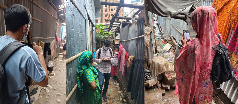
Abu Syed Al-Imam’s experience mirrors a challenge often faced by city officials, planners, and NGOs working in urban development and climate resilience. He was able to gain deep insight into the daily realities of residents in the informal settlements through direct field visits – a process that takes significant time and resources to carry out at scale, especially given the diversity of conditions and challenges in each settlement.
While it is a huge task, on-the-ground data collection plays a significant role in data-driven urban planning. Without accurate and up-to-date information, it’s difficult to know which areas need support and what kind of support they need – and when we don’t know where help is needed, we can’t deliver it.
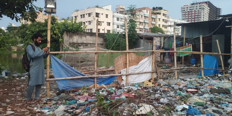
Field mapping of hazard points, including informal waste disposal sites | Photo: Abu Syed Al-Imam
How Youths in Dhaka Are Bringing Informal Settlements to the Map
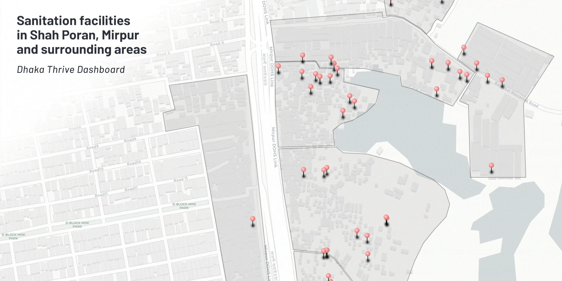
Through the Dhaka Thrive project, a joint initiative between HOT’s Open Mapping Hub - Asia-Pacific and World Vision Bangladesh, we worked with local youths to improve access to open geospatial data in Dhaka’s informal settlements. In its 2024 pilot in Mirpur, North Dhaka, a total of 40 informal settlements were mapped, and the resulting data was visualized and made freely accessible through the Dhaka Thrive Dashboard.
The Dhaka Thrive Dashboard is a centralized platform that provides visualization of hazard risks, critical lifeline facilities, and other essential information in Dhaka’s informal settlements, including street-level imagery. It equips stakeholders with the insights needed to design informed, sustainable, and resilient urban solutions.
In 2025, the project expanded into a crowdsourced approach through the Dhaka Thrive Challenge, allowing broader mapping contributions from community members. Running from July to September, participants, all local youths, actively collected field data. This helped enhance the dashboard with deeper insights and wider area coverage, creating a stronger foundation for informed planning and decision-making.
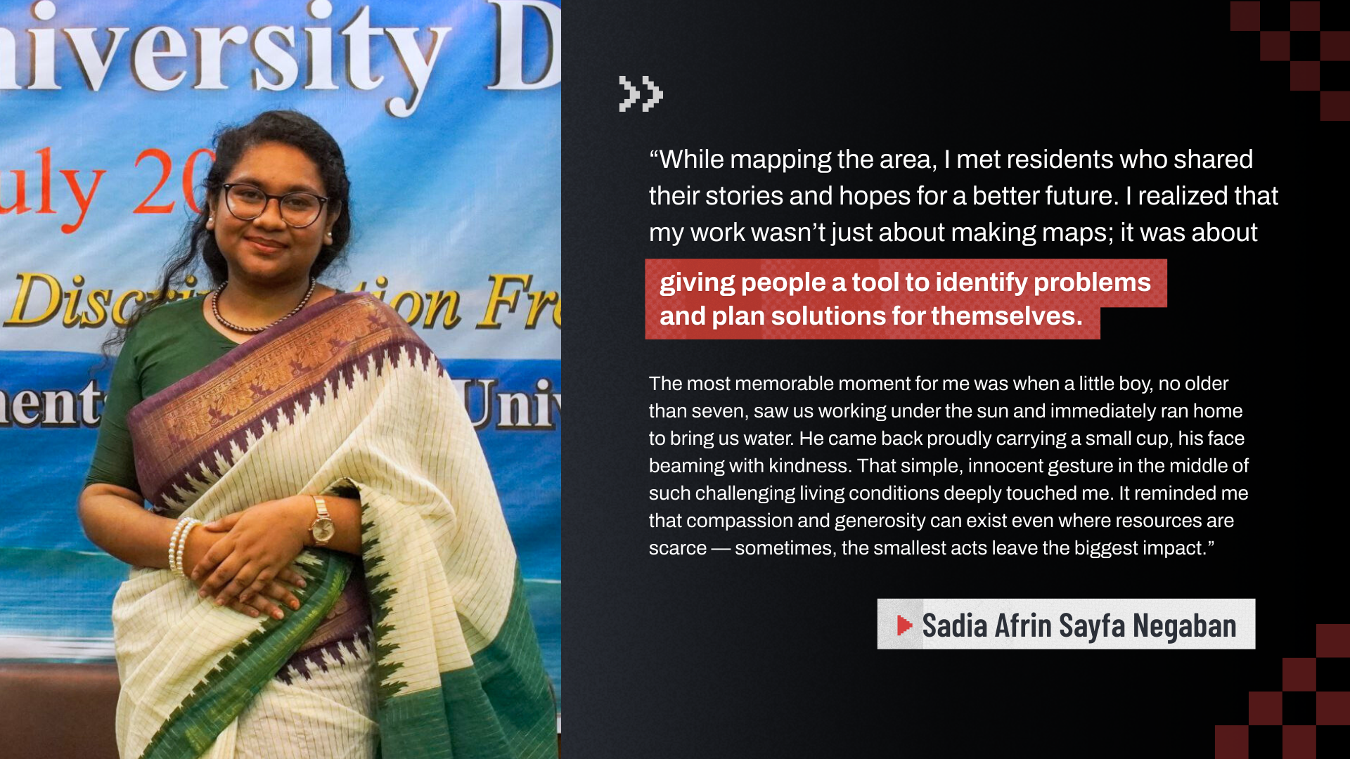
The impact of the challenge went beyond improving the data. As the youths interacted with communities in the field, they witnessed residents’ positive responses to their mapping activities and listened to the hopes and concerns they shared. Through this experience, it became clear that, although small at first glance, each individual data they collected was critical in shaping and strengthening Dhaka’s climate resilience.
Turning Data into Actionable Insights
Around the same time, youths were also engaging with the Dhaka Thrive Dashboard as data users. As part of the Climate Resilience Fellowship, this group of youths used insights from the dashboard to guide their community-driven projects, helping address climate risks across informal settlements in and around Dhaka.
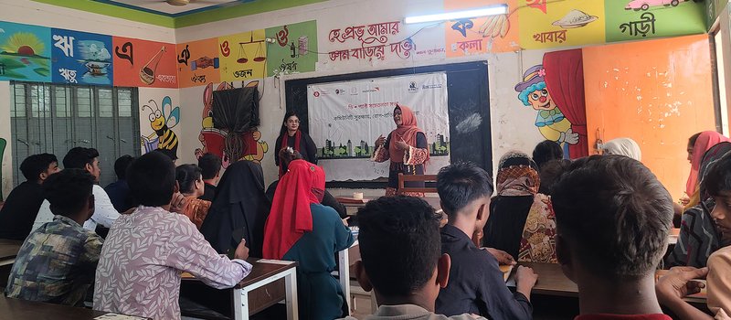
Youth advocacy session on dengue from the D-PACT project | Photo: D-PACT
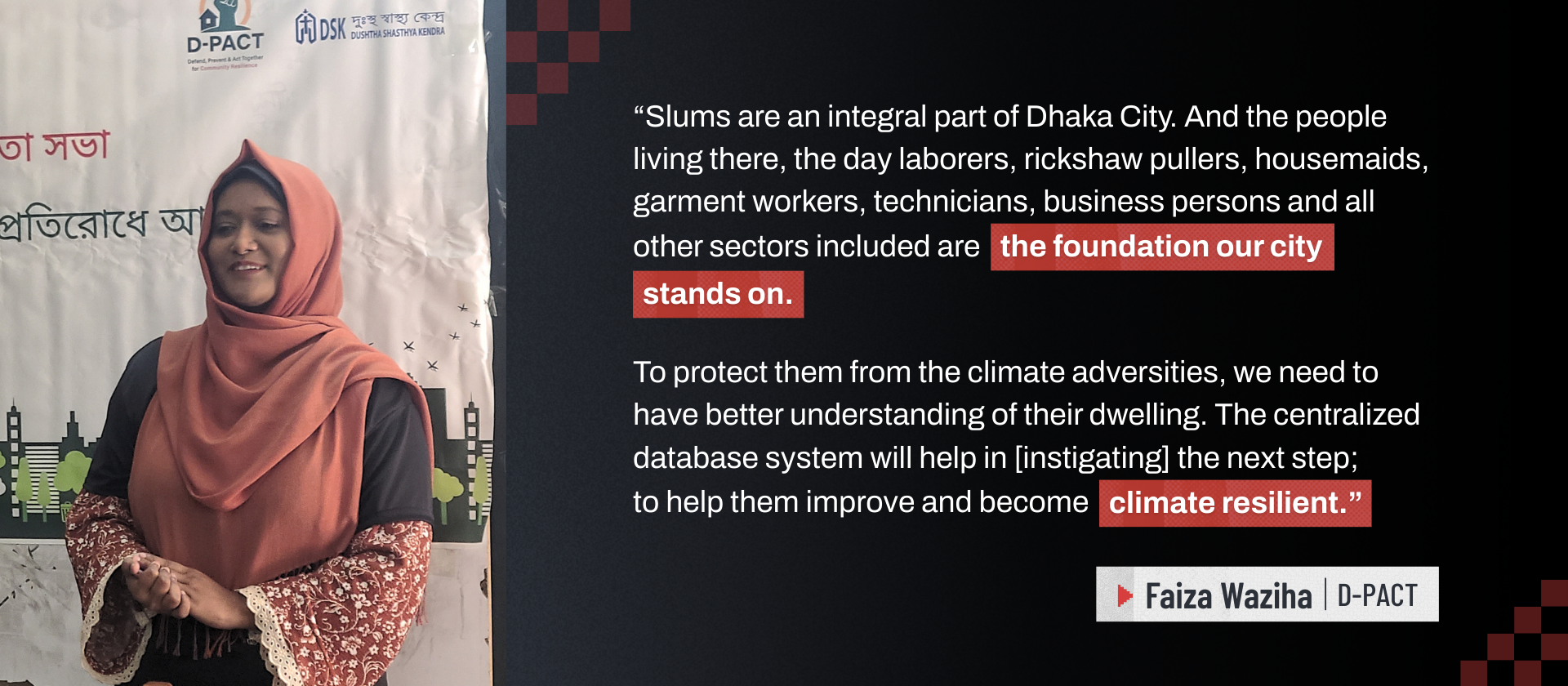
One of those projects was D-PACT, a dengue prevention program led by Faiza Waziha and her team in Jheelpar, Mirpur. With many possible areas to choose from, site selection can be overwhelming, and it is often unclear which areas need help the most. The Dhaka Thrive Dashboard helped her team simplify this process.
“Instead of guessing, we used the dashboard to find a slum that actually fits our project goals—specifically looking for areas with water and drainage issues where mosquitoes breed.”
Using the dashboard, Faiza’s team was able to easily spot areas with high dengue risk.
Similarly, Brazil Singh, whose team was building OSM Academy, a platform to help tackle heatwave issues, used the dashboard to inform site selection, in addition to using local knowledge from team members. Because the dashboard’s fire hazard layer combines existing fire-related risks with heat-stress factors, such as dense buildings and limited green and open space, it is also effective for identifying communities at higher risk of heatwaves.
“Instead of starting from scratch, I was able to access all of [the information needed] directly through the dashboard. For example, I could instantly overlay slum boundaries with heat-hazard layers** and the locations of nearby health facilities. This quickly showed me which slum areas were highly exposed to heat stress but had poor access to healthcare.”
**The dashboard’s fire hazard layer, which includes heat factors

By layering data on hospitals, shelters, and water points with the fire hazard layer, Brazil and his team could clearly identify areas at high heatwave risk but with limited access to essential services.
Had the dashboard not been available, Brazil added that his team would have spent weeks collecting and cleaning datasets, aligning coordinate systems, and manually comparing maps. “With the centralized data repository, I could complete this analysis in a single session, allowing me to move faster into field planning, stakeholder discussions, and designing targeted interventions.”
Having more time to focus on community-level planning, OSM Academy effectively delivered 10 comprehensive heatwave training sessions and distributed 150 essential Heat Kits across two informal settlements. From these sessions, 220 women emerged as household-level heatwave awareness communicators, gaining essential knowledge on early symptom recognition and immediate response.
One of the trained community members, Rojina shared, “We didn’t understand the risks of heatwaves so well before, but now we can inform others.”
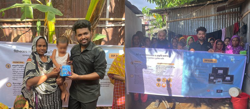
Community training and distribution of Heat Kits, which included oral rehydration solution (ORS) packets, hygiene products, and temperature guidance cards. | Photo: OSM Academy
Going Beyond Site Selection: Mapping Methodology and Visualization
The dashboard use went beyond simply choosing project areas. In some projects, fellows used the dashboard and its accompanying data collection form as a guideline for their mapping methodology.
Training on waste segregation with waste champions and community members in Ershad Nagar | Photo: Ramisa Maliha / The Resilient Trashformers
In Ershad Nagar, Tongi, Nafisa Nandini and Asif Bin Alam Seum were leading a community-driven waste management initiative. Even though their project took place outside of Mirpur, where most of the dashboard’s data was concentrated, the dashboard still provided crucial guidance for them.
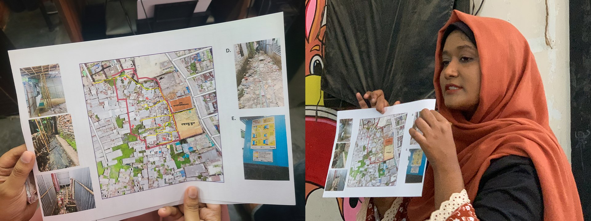
“Ershad Nagar was not previously mapped in the Dhaka Thrive Dashboard, so we conducted hazard point mapping in part of our project area following the Dhaka Thrive hazard mapping methodology and using the same KoboToolbox questionnaire. This helped us generate compatible data and integrate our findings into the Dhaka Thrive framework,” Nafisa shared.
Using the mapped hazard data, she then created clear, actionable maps to highlight areas with severe waste accumulation, open drains, and waterlogging risks. “This allowed us to select the most vulnerable households, target interventions more effectively, and design trainings that directly addressed the community’s real risks.”
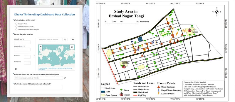
The Dhaka Thrive Dashboard’s KoboToolbox questionnaire guided the team on which types of hazard points to collect. The data was then used to create a visual map crucial for the project’s next steps. | Map visualization: Nafisa Nandini / The Resilient Trashformers
To build a sustainable waste management program, training was a key component of Nafisa and Seum’s project. In this case, the map served as a powerful tool to guide discussions and workshops. Seum emphasized that it was instrumental in helping shift the community’s perspective.
“[The map] empowered the community to see beyond their own doorstep. While they knew their individual struggles, seeing the hazards visualized on the map helped them understand the collective risk facing the whole block. It shifted the conversation from 'my problem' to 'our problem,' which made them much more eager to support the solution we proposed.”
Combined with incentive-based recycling, the project engaged more than 50 households, clearing over 300 kg of plastic waste. Most importantly, it mobilized 15 local women and youth champions through community-owned “Waste Clubs,” who will continue leading and sustaining waste management efforts.
Dengue hazard mapping by the D-PACT team and volunteers | Photo: D-PACT
Back to Faiza’s project on dengue prevention, her team also adopted the Dhaka Thrive mapping methodology, focusing on risks and critical facilities related to dengue. In addition, they also used the dashboard as a reference to guide their map visualization.
“The [Dhaka Thrive] Dashboard acted as a template [for us],” Faiza explained. “It showed us exactly what facilities were worth mapping and how to get that information from the locals. It also gave us a clear example of how to visualize the data later—like how to show drainage systems or mosquito breeding zones on a map. It was really helpful because we could see what the 'finished product' should look like before we even started working, which took a lot of the guesswork out of the process.”
The D-PACT Dashboard, built using uMap, visualizes key data on dengue risk and essential facilities in Jheelpar. Using Dhaka Thrive as guidance, Faiza’s team adapted what works and tailored them to the dengue context. | Map visualization: Faiza Waziha
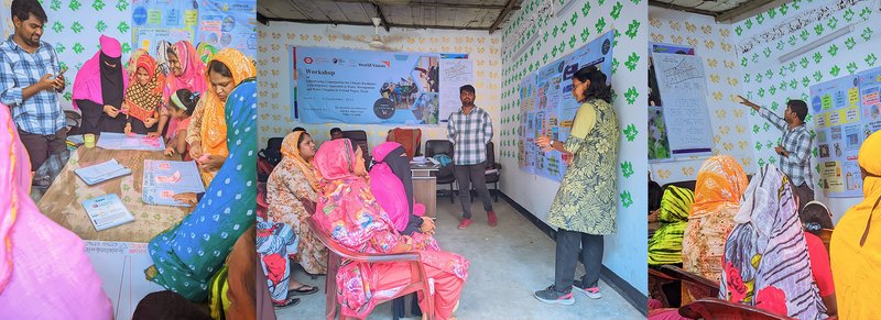
Alongside printed maps, the D-PACT Dashboard made it easier to convey complex risk information to stakeholders. Throughout the project, the team successfully engaged over 70 community members in climate-health and vector-borne disease prevention sessions, with more than half participants being youth and women.
Within these engagements, 32 local youths participated in an advocacy session on how community-based mapping, awareness, and action are interconnected and together reinforce climate and health resilience. Part of the session included a community map validation exercise.
“[The maps] allowed us to show, not just tell. Instead of just giving general advice about dengue, we sat down with the local youth and showed them the maps. We could point to a specific spot and say, 'This area is high-risk,' and then pull up the Mapillary photos to show them exactly why—like a stagnant drain or a specific trash pile. Seeing their own streets on the screen made the risk real and helped them understand exactly what to look out for.”
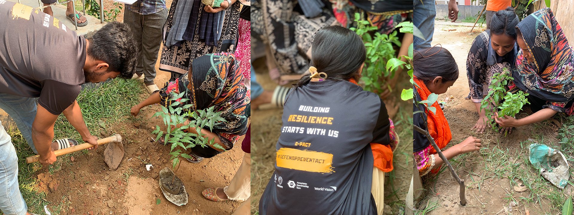
Afterward, the youths went into action and planted mosquito-repellent trees in selected locations across the neighbourhood. To complement this, seven youths formed a community team committed to continuing awareness activities and supporting monitoring of areas with high-dengue risk.
Integrating Community Data Back into the Dashboard
Some projects did not only use the dashboard, but also enriched it with data collected during their implementation. Local hazard points, facilities, and other project-specific insights were added, making the dashboard more comprehensive, up-to-date, and actionable.
Even in areas that were already well mapped, conditions can change over time. New hazard points may appear, previously identified risks may be resolved, and facilities may open, close, or relocate. Keeping the dashboard open to community contributions allows stakeholders to continuously update information, ensuring it remains accurate and relevant.
Looking Forward: The Future of Dhaka’s Urban Resilience
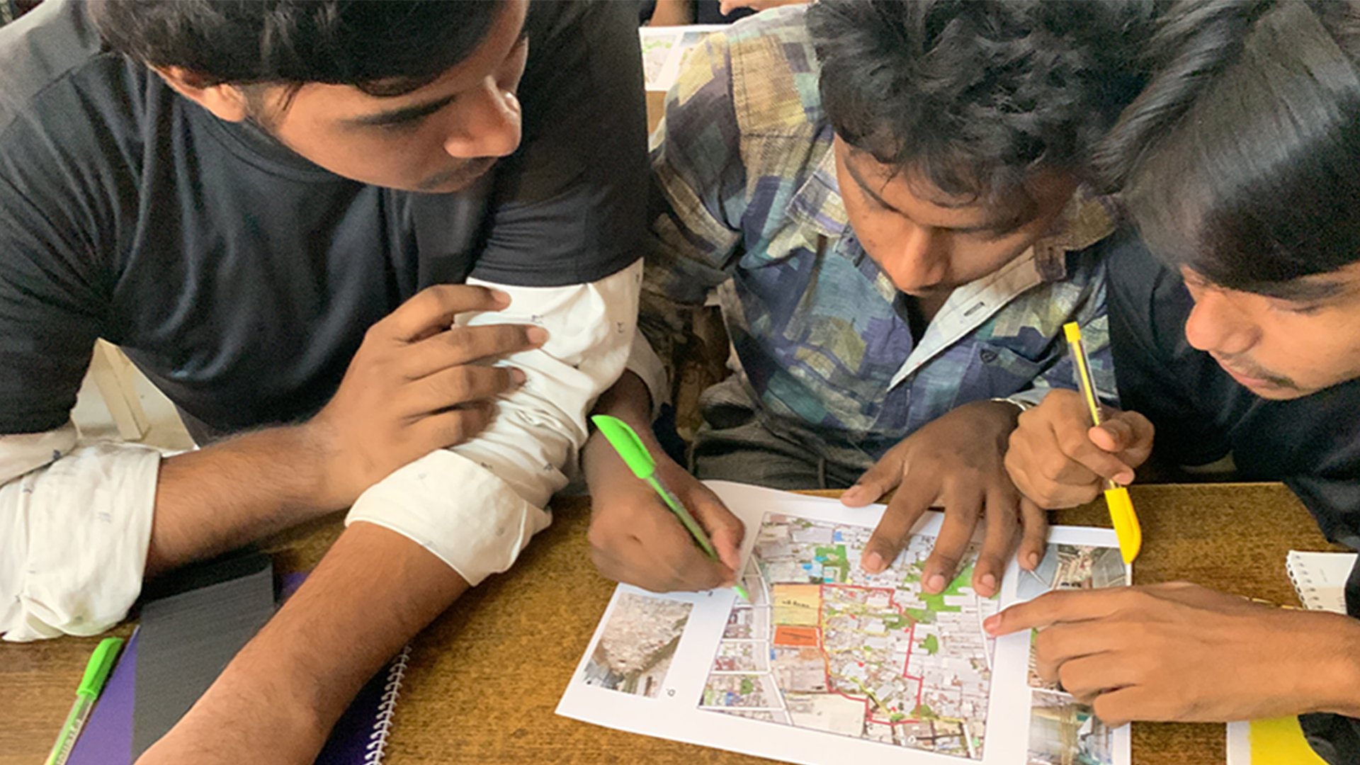
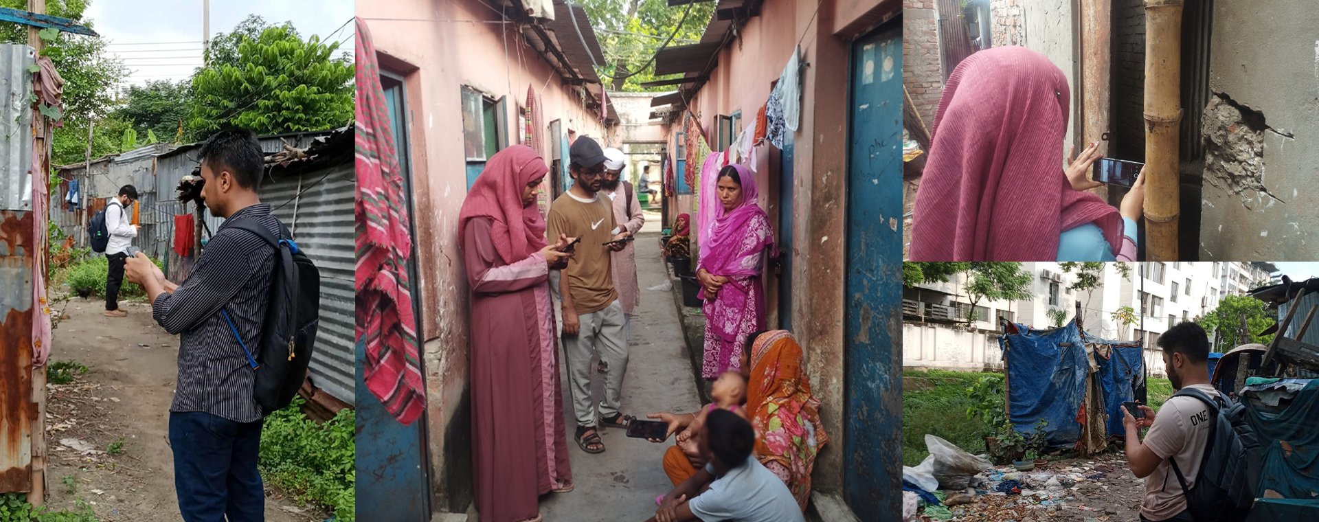
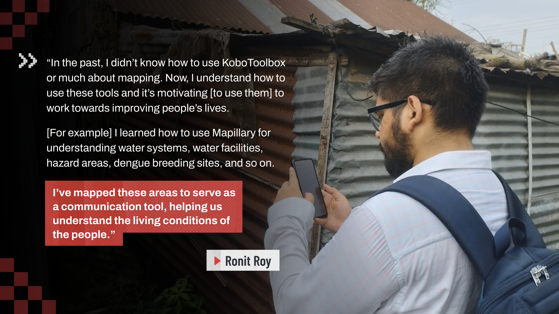
Dhaka Thrive Challenge participants during field mapping | Photo: Ronit Roy
From the community-driven data collection to the various dashboard use cases, one idea consistently echoes: small actions can create significant, meaningful impact.
At its core, as a centralized data hub for Dhaka’s informal settlements, the Dhaka Thrive Dashboard has the potential to really change the way we work across sectors. Whether the focus is climate resilience, inclusive urban planning, or community-driven action, having a shared, accessible, and up-to-date platform opens many new possibilities for innovative solutions and initiatives to arise. This is especially critical in informal settlements, where data has long been fragmented, outdated, or unavailable.
Ultimately, what makes the platform especially powerful is that the data is truly open. It is not just for government agencies or NGOs. Local community members can access, use, and contribute to it themselves. As a result, communities are starting to take more action in building and owning the data, with youths leading through participation, innovation, and a strong drive to actively shape the future of their city and communities.
By turning local knowledge and community contributions into actionable insights, the Dhaka Thrive Dashboard is helping build a more inclusive Dhaka – one where communities can work together and use open data to strengthen climate resilience and shape a better urban future.
Get Involved
If you live in or around Dhaka, join the movement! Contribute and add your local data to the map through this form. For bulk data contributions and further inquiries, reach out to us at openmappinghub.ap@hotosm.org.
Share